A good friend (John) brought up a great point about maps in his last comment... and it sent me on a map spree.
I LOVE MAPS. Really, I do. You wanna make me happy? Give me a big atlas and watch my imagination soar. Maps online are not that cool, not compared to having the real thing in your hand; running your finger across places that you may never see, or might not even be that interesting to see, but none-the-less, they are there for you to pour over. How nice, eh?
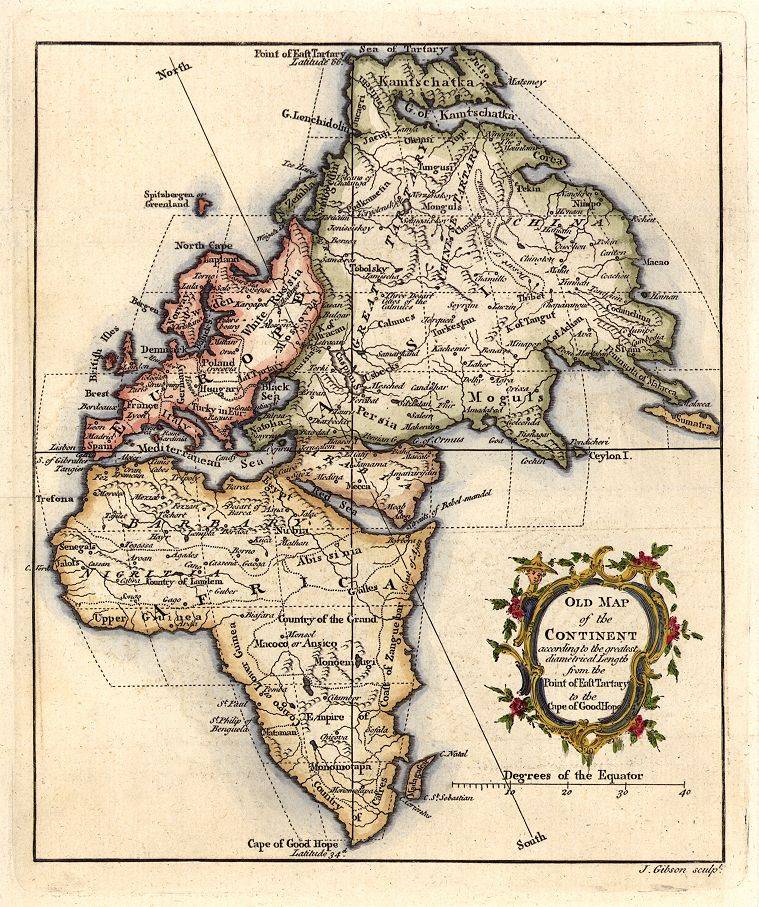
My favorites are maps of the Middle East, Eastern Europe, Russia, the landlocked countries of Central Asia and places around the Black, Caspian, and Aral (of whats left of it) Seas.
I also get a kick out of old maps. How did Europeans view of the world based on maps change their mentality? Or did it? Does an environment dictate the choies, views and/or actions of a given aggregation of people, now matter how small or large?
Questions linger like cigarette smoke in a bar that just won't stop its attack on your nostrils. Speaking of that kind of thing, by the New Year, The Netherlands will adopt an indoor smoking ban. Great success for clothes and upholstery!
Here are some maps I like:


On another note, In Hengelo (where my friend Wouter comes from) I was with another of our friends and we came across a charming young girl wearing this old-time Dutch outfit. I asked her "Spreek jij een beetje Ingles?" to which she replied "Nee, allen Nederlands..." And Max (friend) then asked her if we could get a picture of her and me.
Here it is:

Great success!
I hope you are all enjoying yourselves.
Spread the love,
-e(ric)
2 comments:
I LOVE maps too! Your blog entry has inspired me to assign a writing about maps in 7th grade!!! Thank you Eric!!!
Mrs. Strict
The bottom map on your list is the perfect example! Notice how Germany and the US appear much larger than they should. Rather than centering on the equator, the map seems to center on the Tropic of Cancer. Europe appears the same size as Africa, when we know it's actually only one third as large. Fascinating example of science (cartography) being distorted by ethnocentrism.
Post a Comment